Sundogs
The Client
A Swift Current club volleyball organization, the Sundogs gives kids and teens in the area opportunities to play volleyball. The organization offers participants programs and activities to develop their volleyball skills and the chance to hone their competitive edge and test their skills in tournaments. Volleyball is their game.
Project Overview
Branding
This project began with developing new Sundogs branding. The organization wanted to shift the brand image to something more modern and sleek. The initial step was a new logo design. The organization’s previous logo played heavily into the ‘dogs’ part of the name with a cartoon visual of a dog associated with the brand as well as a cartoon style logo, but the Sundogs wanted to move away from both these elements.
After initial discussions, the Landing Studio went in to design some sample concepts. The new designs focused on the wordmark, though some samples had volleyball icons incorporated and sundog (the light phenomenon) elements. Bold fonts were used to help the wordmarks stand out in all the logos and some were in italics to give off a sense of motion to give a sense of motion.
After another round of iterations incorporating client feedback, the Sundogs selected a new logo and the Landing Studio provided various sizes, colour versions, and file types along with a set of brand guidelines for logo usage and brand colours. Though not an extensive branding guide, having a set of codified use guidelines can help keep an organization and encourage the production of unified, cohesive, design in marketing materials.
New Sundogs logo
Website
Because the Sundogs were beginning their tryout registration not long after the project was started, the website began as a single tryouts page with a link to an ecommerce product page where users could pay and sign up to register for tryouts.
The Sundogs had an existing website that the Landing Studio transferred some content from, but the appearance, navigation, and functionality for users and the Sundogs leaders was modified for improvement.
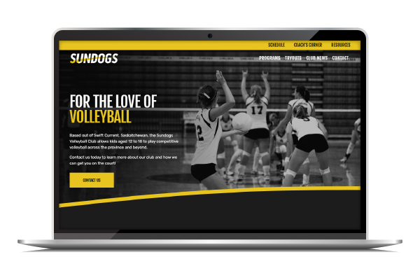
In terms of appearance, like the new logo, the design aesthetic was modern and sleek, perhaps even a bit edgy, using a bold font for headings and clean sans-serif for regular text. Colour was limited to Black, White, Grey and a golden yellow accent colour. The Landing Studio used slightly curved dividers meant to echo the path of a volleyball, similar to a serve path.
The new navigation removed some items from the previous website. Some pages were consolidated into a single page. The navigation is split into two bars to help users more easily find content relevant to them. To explain, the secondary navigation with the Schedule, Coach’s Corner, and Resources is more pertinent to users who are already affiliated with the club, and the primary navigation with links to Programs, Tryouts, Club News, and Contact is more likely to be of interest to new prospects.
In terms of functionality, the Sundogs new website is designed to be a helpful communications tool for the Sundogs, as well as an administrative tool for collecting payments.
Several tools to assist with communications were included in the Sundogs website design. One communication tool is the Club News page, where the Sundogs team can post news and announcements which will also automatically show up in a feed on the homepage. Another communication tool is events tool where the Sundogs can post events like tournaments and special programs. Finally, the Landing Studio also included a blog page where coaches can share helpful tips, advice etc. with players.
To help with club administration, the Sundogs website includes ecommerce functions. For example, the Sundogs team can create products to collect tryout registration fees online. This may make it easier for participants to pre-pay fees before the actual tryout day.
To conclude, the Sundogs project was energizing and exciting to work on. The Landing Studio enjoyed being able to explore and think about branding in the context of a sports team. We appreciated having to get creative to come up with designs and concepts that expressed the dynamism and passion of the Sundogs volleyball club. We also liked the challenge of coming up with ways to make a website that provided tools to help the Sundogs with their communications and program administration needs and wants. Thanks for the opportunity Sundogs! Go team(s)!